Overlays
Draggable overlays for labels, buttons and custom menus that float above the game.
Draggable Labels
Draggable Labels are compact, draggable overlays containing text. They are ideal for surfacing information such as FPS, ping, server info, etc. The feature is inspired by the LinoriaLib UI Library Watermark feature.
AddDraggableLabel
Adds a draggable label to the UI.
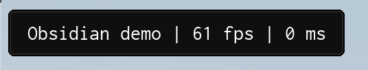
local DraggableLabel = Library:AddDraggableLabel("Obsidian demo")| Arg Idx | Argument Description | Type | Default |
|---|---|---|---|
| 1 | Text to display in the draggable label | string | nil |
| 2 | Icon to display in the draggable label (Lucide icon Name or Roblox Asset ID) | string | number |
| 3 | Position of the icon (either "Left" or "Right") | string | "Left" |
Methods
SetText
Sets the draggable label text.
DraggableLabel:SetText("Obsidian demo v2")| Arg Idx | Argument Description | Type | Default |
|---|---|---|---|
| 1 | Text to display in the draggable label | string | nil |
SetVisible
Sets the draggable label visibility.
DraggableLabel:SetVisible(false)| Arg Idx | Argument Description | Type | Default |
|---|---|---|---|
| 1 | Whether to show the draggable label | boolean | true |
Destroy
Destroys the draggable label.
DraggableLabel:Destroy()Example
-- Sets the draggable label visibility
local DraggableLabel = Library:AddDraggableLabel("Obsidian demo")
DraggableLabel:SetVisible(true)

-- Example of dynamically-updating draggable label with common traits (fps and ping)
local FrameTimer = tick()
local FrameCounter = 0;
local FPS = 60;

local WatermarkConnection = game:GetService('RunService').RenderStepped:Connect(function()
    FrameCounter += 1;

    if (tick() - FrameTimer) >= 1 then
        FPS = FrameCounter;
        FrameTimer = tick();
        FrameCounter = 0;
    end;

    DraggableLabel:SetText(('Obsidian demo | %s fps | %s ms'):format(
        math.floor(FPS),
        math.floor(game:GetService('Stats').Network.ServerStatsItem['Data Ping']:GetValue()) -- Use LocalPlayer:GetNetworkPing() inside Studio
    ));
end);
Draggable Buttons
Draggable Buttons are compact floating buttons that can be dragged around the screen. When clicked, they fire a callback and pass themselves as the first argument.
AddDraggableButton
Adds a draggable button to the UI.
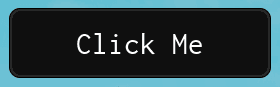
local DraggableButton = Library:AddDraggableButton("Click Me", function(self)
    print("Button was clicked!")
end)| Arg Idx | Argument Description | Type | Default |
|---|---|---|---|
| 1 | Text to display on the button | string | nil |
| 2 | Callback fired when clicked (receives the button table) | function | nil |
| 3 | Whether to exclude DPI scaling from this button | boolean? | false |
| 4 | Icon to display on the button (Lucide icon Name or Roblox Asset ID) | string | number | nil |
| 5 | Position of the icon (either "Left" or "Right") | string | "Left" |
Methods
SetText
Sets the button text and auto-resizes the button to fit.
DraggableButton:SetText("New Text")| Arg Idx | Argument Description | Type | Default |
|---|---|---|---|
| 1 | Text to display on the button | string | nil |
Destroy
Destroys the draggable button.
DraggableButton:Destroy()Draggable Menus
Draggable Menus are floating panels with a title bar and a content container. They are useful for building custom floating windows with any content you want.
AddDraggableMenu
Creates a draggable menu and returns the holder frame and content container.
local Holder, Container = Library:AddDraggableMenu("My Menu")

-- Holder => The outer frame (the draggable window)
-- Container => The inner frame with a UIListLayout (add your UI elements here)| Arg Idx | Argument Description | Type | Default |
|---|---|---|---|
| 1 | Title text for the menu header | string | nil |
Methods
Destroy
Destroys the draggable menu.
Holder:Destroy()Example
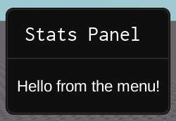
local Holder, Container = Library:AddDraggableMenu("Stats Panel")

-- Add custom content to the container
local Label = Instance.new("TextLabel")
Label.Text = "Hello from the menu!"
Label.Size = UDim2.new(0, 100, 0, 24)
Label.BackgroundTransparency = 1
Label.TextColor3 = Color3.new(1, 1, 1)
Label.ZIndex = 11
Label.Parent = Container
Draggable Menus renders at ZIndex 10. Any child elements you add to the container must have a ZIndex of 10 or higher, otherwise they will be hidden behind the menu frame.